한국의
한국의  Español
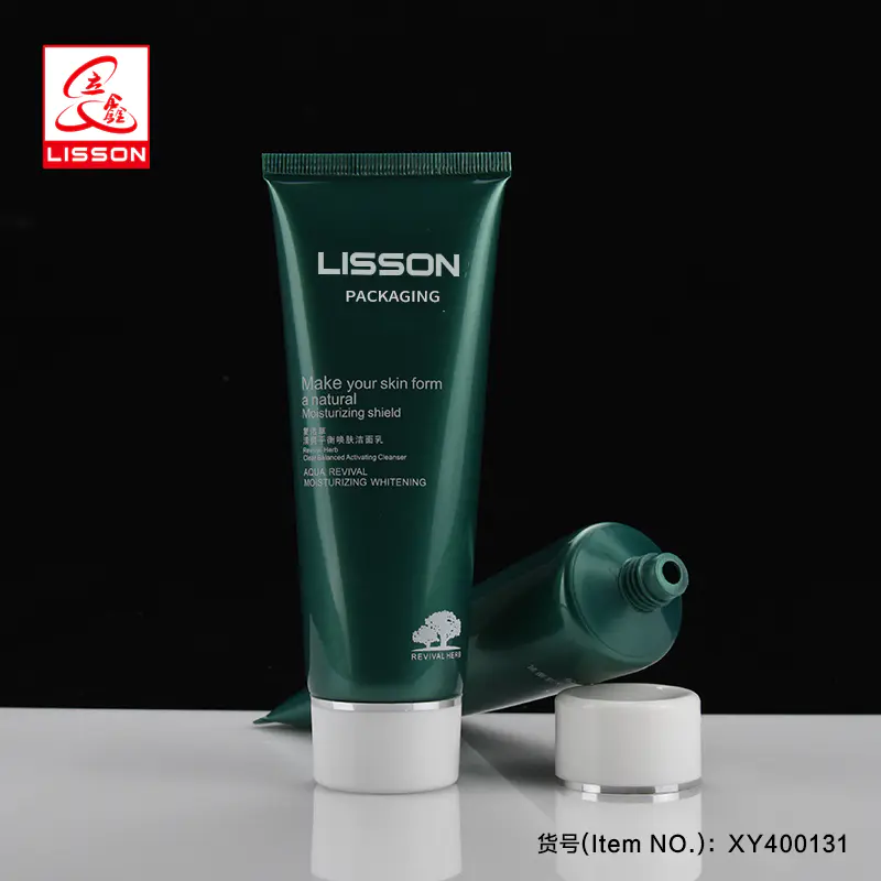
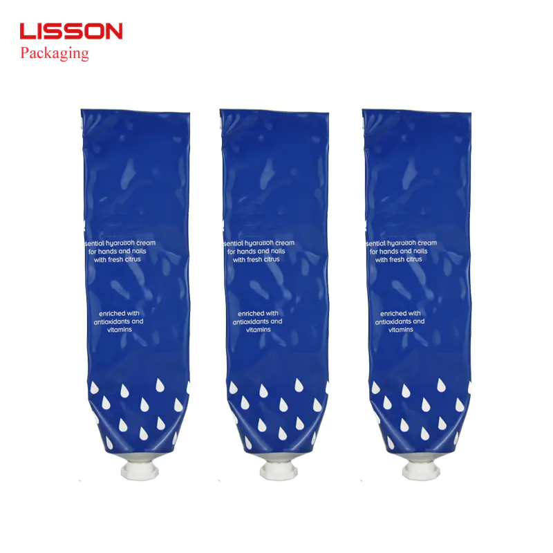
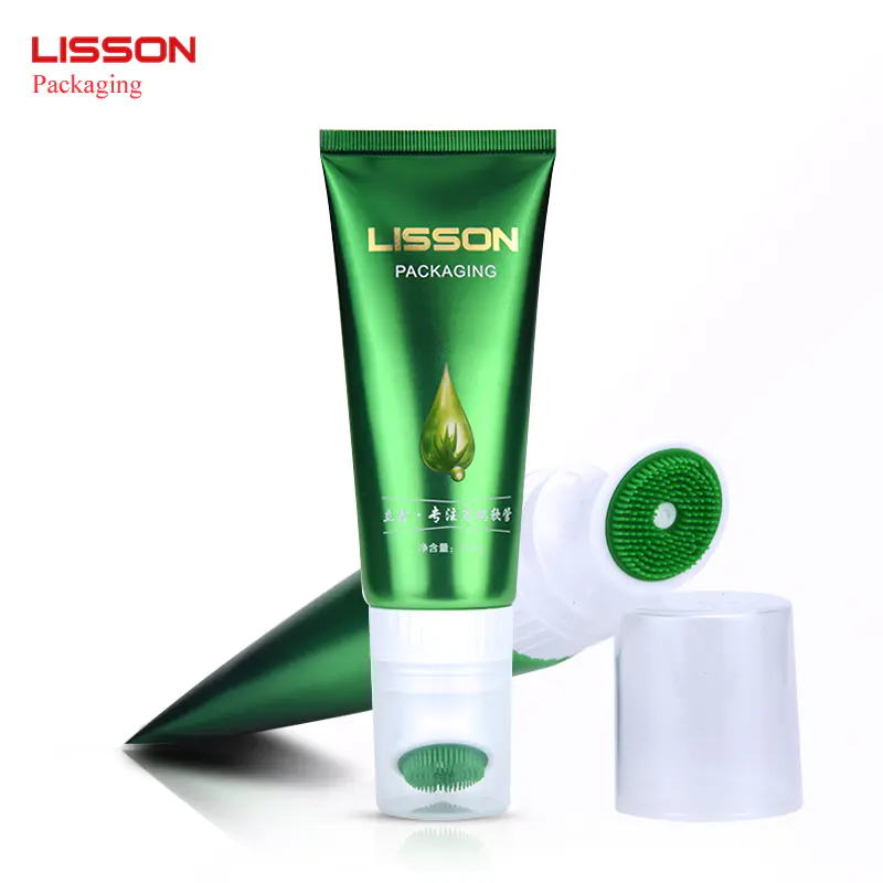
Latest products
Color in packaging design tool - Pantone color card
by:Lisson
2020-11-17
Color in packaging design tool -
The colors in pantone color card packaging design tool -
Pantone color card
in this rapidly changing world, the use of color has quietly changed Its functions and express delivery of information is more important than its own purely aesthetic value. Color is the visual communication of a highly symbolic element symbols, it will be in our life to form a new global language. Even without a word, as long as you follow the color code can also help us to understand each other and are closely linked together. The color can be used as a global language. Is different from written language, the language used to specify the color classification, so that we can be identified. It can make life easier, by color to find what you want. We see color when the reaction is instantaneous, while there is no denying that the instantaneous reaction will be to do every day, we decided to have a profound impact. Therefore, commodity packaging color design in the modern marketing plays a more and more important role.
to human visual aspects of the study showed that in all the aspects that constitute the product packaging, color can be the earliest, the most touches people happily, be able to guide consumers in a short period of time to make the right choice of the primary factor, directly stimulate the desire of the buyer. Packaging colour effect is colour preferred consumer attention because it gives the product packaging particular emotion and image, compared with other means of advertising, it is more easy to attract consumers' attention.
in packaging design, the use of colour is crucial, besides can reflect the user's unique style, color and an important psychological effect. From red, orange, yellow wait for warm color, for example, would be reminiscent of fire, the sun, to have a warm feeling; From the cool color such as white, blue and blue green associate with snow and ice, oceans and tree-lined, feel cool and refreshing. Bright, warm color gives a person lively feeling, deep dark melancholy sense to the person. White and other solid color combination can make a person feel very lively, the black is blue color. The psychological effect can be effectively used in the packaging color mood, and these color processing can largely determine the goods sell well or not. In modern society, commodity packaging on the image, use of color in the process of the circulation of goods will take precedence for consumers, people's important role. Packaging color, therefore, has become an important part of commodity brand image
as a result, in the field of packaging design, designers need to have a unique understanding of color, the color of the deployment, excessive and neutralization has their own opinion, the designer can control international standards Pantone color card, color with Pantone Matching System, can provide different colors according to different customers recipe plan, give customers more choice and experience, and satisfaction to its unique personalized packaging design.
in other words, the designer only in the practical application of flexible master colour diversity, to manage the colors of package design, and in the use of color design, colorific contrast and harmony is a very important principle to obtain aesthetic feeling.
to xiao package knowledge, pantone color card, PANTONE color card) Authority is famous in the world of color, printing, textile, plastic, graphics, color of the digital technology in areas such as communication systems, has become the international unified standard language communication color information today. Since 1963, will focus on the research and development in the field of color, there are 1677 species of pantone color for the designer to choose. Conversion table packaging printing knowledge
Custom message