한국의
한국의  Español
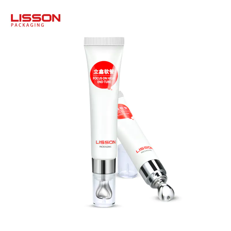
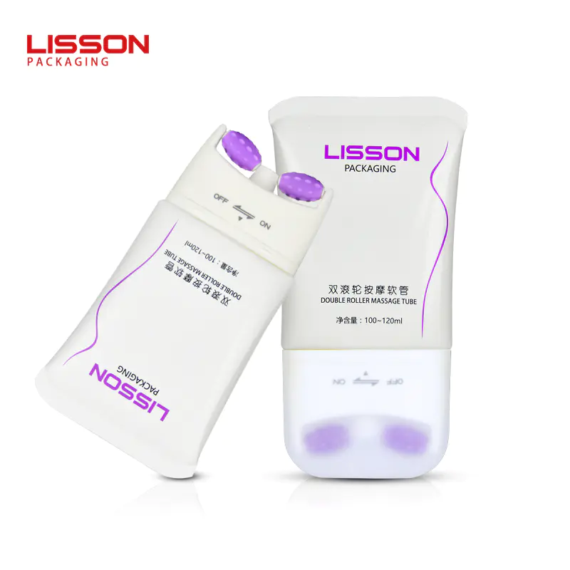
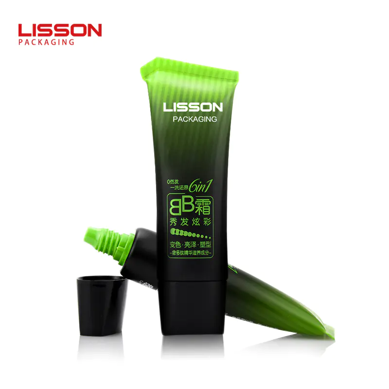
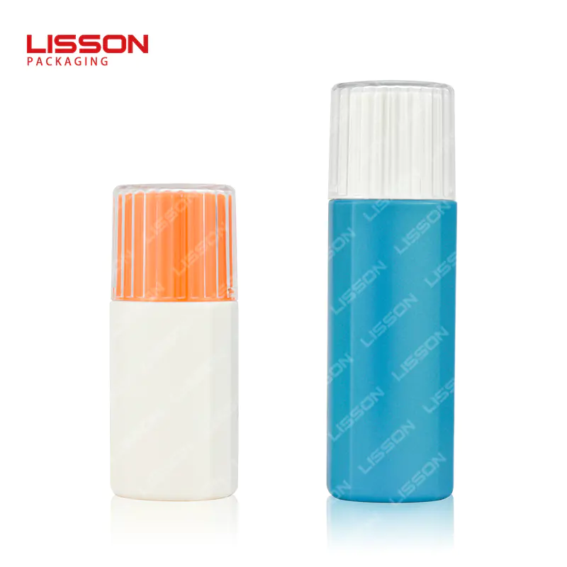
Latest products
Color rhythm, color echo of packaging color design and color
by:Lisson
2020-11-17
Color rhythm, color echo of packaging color design and color on the color rhythm, color echo of packaging color design and color key
color rhythm is obvious with time and motion characteristics, can feel the strength of the regular recurring and length variation, is one of the formal order. Through color separation, overlapping, repeatedly, conversion, etc, formed in the color change, the cyclotron rhythm, the beauty of rhythm. Generally there are three kinds of forms.
1, repetitive rhythm by color dot, line and surface morphology of repeated, reflect aesthetic feeling to bottom. Simple rhythm has a shorter cycle time and repeat to achieve uniform characteristics, mechanical and rational aesthetic feeling.
2, gradient rhythm will be step by step color by a directional pattern changes in time series, it is relatively played down the 'beat' consciousness, have longer cycle characteristics, obvious contrast, static in see move all climax of flash color effect. Rhythm of gradual change of hue, lightness, purity, changes in temperature, complementary color, area, comprehensive goes on in the form.
3, diverse rhythm is composed of a variety of simple and repetitive rhythm, their sharp slow in movement, strong or weak, amiable form constraints, ups and downs are certain rule, also known as the complex rhythm rhythm. Its characteristic is colour movement is very strong, level is very rich, form and changeable. But such as processing, improper use, easy to appear chaotic noise 'color' bad effects.
color echo: also called color.
color echo for the use of a or the colour of related plane, space, different positions, to avoid isolation between each other, using 'sometimes-complex mix-and-match, I have you' watching out for each other, interdependence, the repeated use of technique, so as to achieve a unified coordination, interest is full of rhythm beauty again and again. Color echo technique generally has two kinds:
1, the dispersion method will be one or several colors appear in different parts of the picture at the same time, make whole tonal unity in a certain style, such as pale blue, pale red, dark green color combination, light color as a large area of tone color, dark as a small area of contrasting colors, become a pastel high tone type. At this point, blackish green color had better not only in one place, relatively concentrated, can be appropriately in other parts of some echo, make its produce against each other. But the colour is not as well too scattered, lest make the picture appear flat, fuzzy, messy, burdensome.
2, series, make one or more colors appear in the work at the same time, the product of different plane and space, and form a series of design, can produce together, the feeling of whole.
color key
the color key: in the process of equipping tonal, sometimes in order to improve the status of the overall design monotonous, dull and boring, enhance vitality feeling, often in the works, or set up certain parts, mainly focus on color, to draw the dragon point clear. In order to attract the attention of the viewer, the key color generally should choose arrangement or main position in the center of the picture. Focus on the use of color in a modest and moderate should pay attention to the following points:
1, the key color area shoulds not be too large, otherwise easy clashed with advocate tone color, offset, and lose the feeling of a consistent picture. The color around the area is too small, easy to be assimilation, losing role not to be noticed by people. Can only give priority to color area is the focus of the appropriate color, be actively cooperate with and complement, make the color appears is lively as well as unity, and bring out the best in each other each other.
2, focus on color should choose is stronger than the tone color or contrast of color.
3, key color shoulds not be too much, or multiple point without a key, the arrangement of the multicenter will become overdo design, will destroy the effect of primary and secondary, orderly, disorderly, the disadvantages of clutter.
4 key color, not all work Settings.
5, the key color at the same time and the overall color balance should be paid attention to.
color goes on basic composition form color goes on is a special kind of writing form, its composition and image groups also have corresponding characteristics and the basic law. Conversion table packaging printing knowledge
Custom message