한국의
한국의  Español
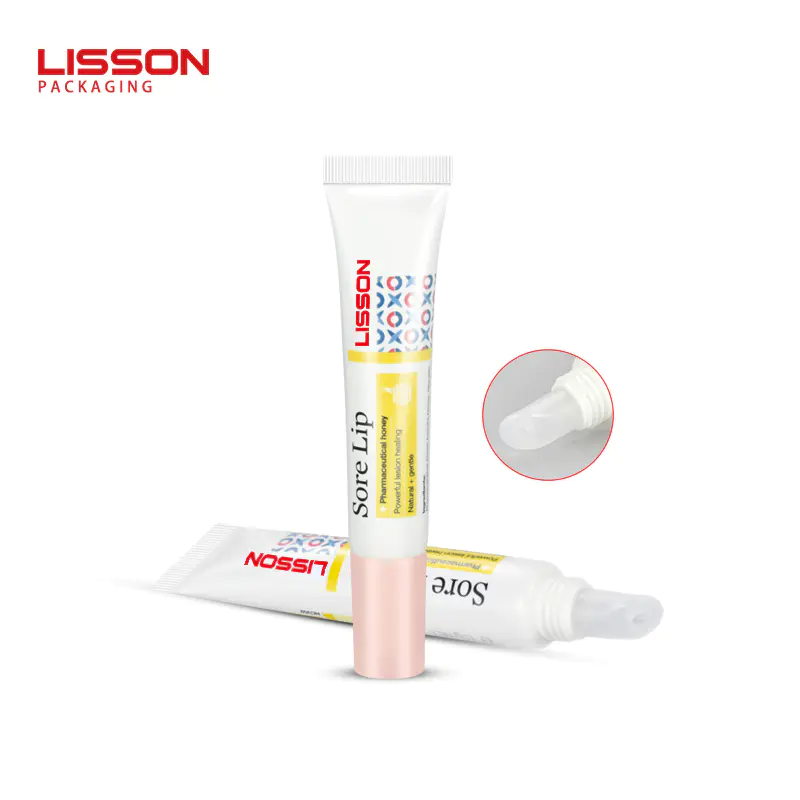
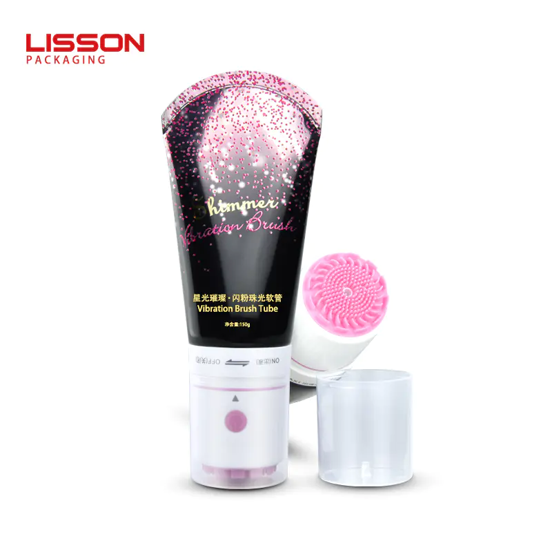
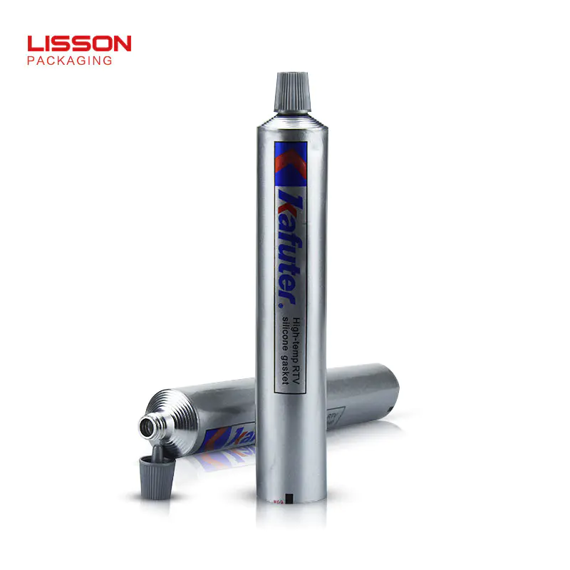
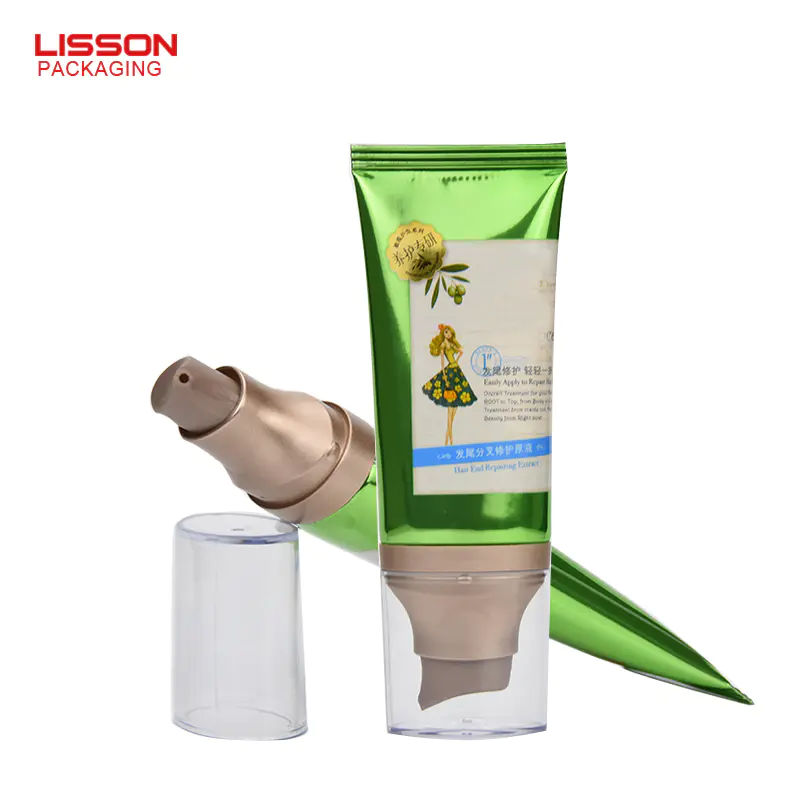
Latest products
'Symbols' in cosmetic packaging!
by:Lisson
2021-03-30
Symbols in cosmetics packaging design mainly refer to symbols such as brand, graphics, text, color, shape, etc., which are designed to convey product concepts or product information. These symbols not only indicate and represent the meaning of things, but also have certain meanings. Emotional meaning, aesthetic meaning.
The promotion of brand symbols has become an international trend. Brands are symbols that allow consumers to clearly remember product features and reflect certain spiritual values. They are mainly designed with logos, standard characters, and standard colors to form the image of corporate products. . Brand building is essentially a semiotic project, and the purpose of brand symbols is to reflect the value of the brand.
Especially the cosmetics of high-end international first-line brands, the meaning of their existence is no longer ordinary daily use to protect the skin, but a luxury. Under this premise, the spiritual value of the brand is even more important. Global cosmetics brands have their own mature brand symbols.
For example: Everyone is familiar with Lancome. Its logo is a rose, pink, tender, shy, and feminine. It seems to be born for a woman. Every woman is like a rose, swaying beautifully, but delicately. Taste, each has its own characteristics and attitude.
Other brands such as Estee Lauder, CD, CHANE, etc. have used brand symbols with simple design and corporate personality, which have become the main theme of corporate brands, run through all levels of corporate image performance, and become an effective means to command corporate integrated communication.
Symbolic graphics are gradually adopted in cosmetic packaging design. Some are used in cosmetic packaging to reflect the characteristics of products; some use graphic symbols to indicate the main raw materials or ingredients of such cosmetics; there are also many uses in cosmetic packaging. The description adopts graphics to express, using several coherent graphics to express more intuitively and clearly.
The text symbols on cosmetic packaging are the basis for consumers to choose cosmetics. The text on the outer packaging of cosmetics mainly includes: trademark, product name, production license number; product use; production date; shelf life; manufacturer name and site; capacity or weight ; Fragrance type; main raw materials; usage method; use precautions and safety warnings; product storage conditions and methods.
These text descriptions are generally relatively concise, mainly based on descriptions. Manufacturers have clever business layouts based on the content they want to express, position them according to the situation in the limited cosmetic packaging space, distinguish the priorities, and arrange them in a unified manner to achieve the best Good results. For the specific use of cosmetics, there are detailed instructions for use in the box.
The packaging of cosmetics is a colorful world. Various brands of cosmetics choose various color symbols to express according to the characteristics of their products. Green is a symbol of nature, embodying vitality, sensibility and freshness. Various shades of green are one of the most commonly used colors in cosmetic packaging; red is also a commonly used color in cosmetics, especially its combination with black or white; purple, gold, and black are symbols of mystery and noble style Color symbols, these colors are also often used to express high-end cosmetics.
If it is said that in the packaging of cosmetics, brand symbols, color symbols, and graphic symbols are the embodiment of cosmetic personality symbols, and text symbols are the embodiment of cosmetics' common symbols, then cosmetics' morphological symbols should be symbols that coexist with commonness and individuality. The packaging form of cosmetics should consider comprehensive issues such as the function and aesthetics of the packaging, such as: what kind of container should liquid, agent, powder and other objects be contained in.
Specific functional requirements make the form of cosmetic packaging have their commonalities. For example, facial cleansers are generally toothpaste-like; powders and eye shadows are generally thin-boxed; eyebrow pencils, eyeliners, and lip liners are generally pen-like; Face creams and night creams are generally canned and so on.
However, the cosmetic packaging of each brand has its own personality, which is mainly reflected in the bottle design, especially in the bottle design of perfume. Some are based on straight lines, and some are based on straight lines. Small curves are the main ones, and some adopt special shapes, and there are all kinds of them.
Products serve people, and packaging has the dual function of serving as a product and guiding consumption. In cosmetic packaging, various symbol elements must be used reasonably to form a unified overall image of the product. Only by breaking through the shackles of traditional concepts and using innovative methods to highlight individuality in the appearance, color and pattern of cosmetic packaging can Will facilitate the promotion of sales.
Custom message